Form+Bang

Form + Bang, a boutique interior design agency founded by two female designers, needed a new website that reflected both their creative identity and the specific way they work with clients. Their vision was to create something that felt girlypop but luxury, while also doubling as a presentation tool for in-person client meetings. Their previous site, built on Squarespace, was limited in both style and functionality, offering little flexibility to showcase case studies in a polished way. The challenge was to design and develop a minimal, elegant, and functional site that could act as both a digital portfolio and a live presentation tool, with a backend system simple enough for the team to manage on their own.

The agency’s existing site failed to reflect the quality and sophistication of their work. Case studies were difficult to present cleanly, and the self-built structure lacked consistency, scalability, and polish. For potential clients meeting with Form + Bang in person, the site wasn’t optimized to serve as a curated, professional showcase of their projects. The lack of a robust CMS also meant the team struggled to update and organize content efficiently.

The primary goal was to design and develop a refined, user-friendly website that represented Form + Bang’s brand ethos while equipping the team with a flexible backend to manage projects and case studies. The site also needed to function in presentation mode, enabling the designers to walk potential clients through their portfolio in real time.

I acted as the Lead UI/UX Designer and Developer, working directly with the founders of Form + Bang. My role spanned research, design, and development: conducting interviews to understand how the site would be used in practice, designing a minimal aesthetic aligned with the agency’s brand, building a custom CMS in Webflow, and implementing the final interactive features such as filtering, animations, and a slideshow presentation mode.

The client’s specific use case, a website that functioned both as a digital presence and a live presentation tool, guided the research process. I focused on identifying how small design agencies typically present their work to clients, and how digital tools could replace traditional slideshows while still feeling polished and professional. From stakeholder conversations, two primary user perspectives emerged. On one hand, there were potential clients who would explore the site independently and needed a clear, elegant way to browse projects. On the other hand, there were the agency founders themselves, who wanted to use the site as a curated presentation deck during in-person meetings.
To satisfy both perspectives, the site needed two layers of usability: seamless browsing for new visitors and a CMS structure that allowed the founders to switch into “presentation mode” with ease. This required a backend system that was flexible enough to handle project images, text, and layouts, while staying simple enough for the small team to manage without external support.
A key element of this was the custom case study filtering system I developed within the CMS. Each project could be tagged across multiple categories, Interiors, Architecture, or Objects, with subcategories such as Wellness, Residential, Storefronts, or Packaging. These tags allowed projects to appear dynamically under multiple filters, ensuring visitors could easily find the type of work most relevant to them. On the backend, the CMS provided a structured tagging system that made it effortless for the founders to assign projects to multiple categories during upload, ensuring consistency and accuracy across the site. On the front end, the dropdown filters (as seen above) created an intuitive browsing experience that aligned with the site’s dual purpose: both as an online portfolio and as a live presentation tool.

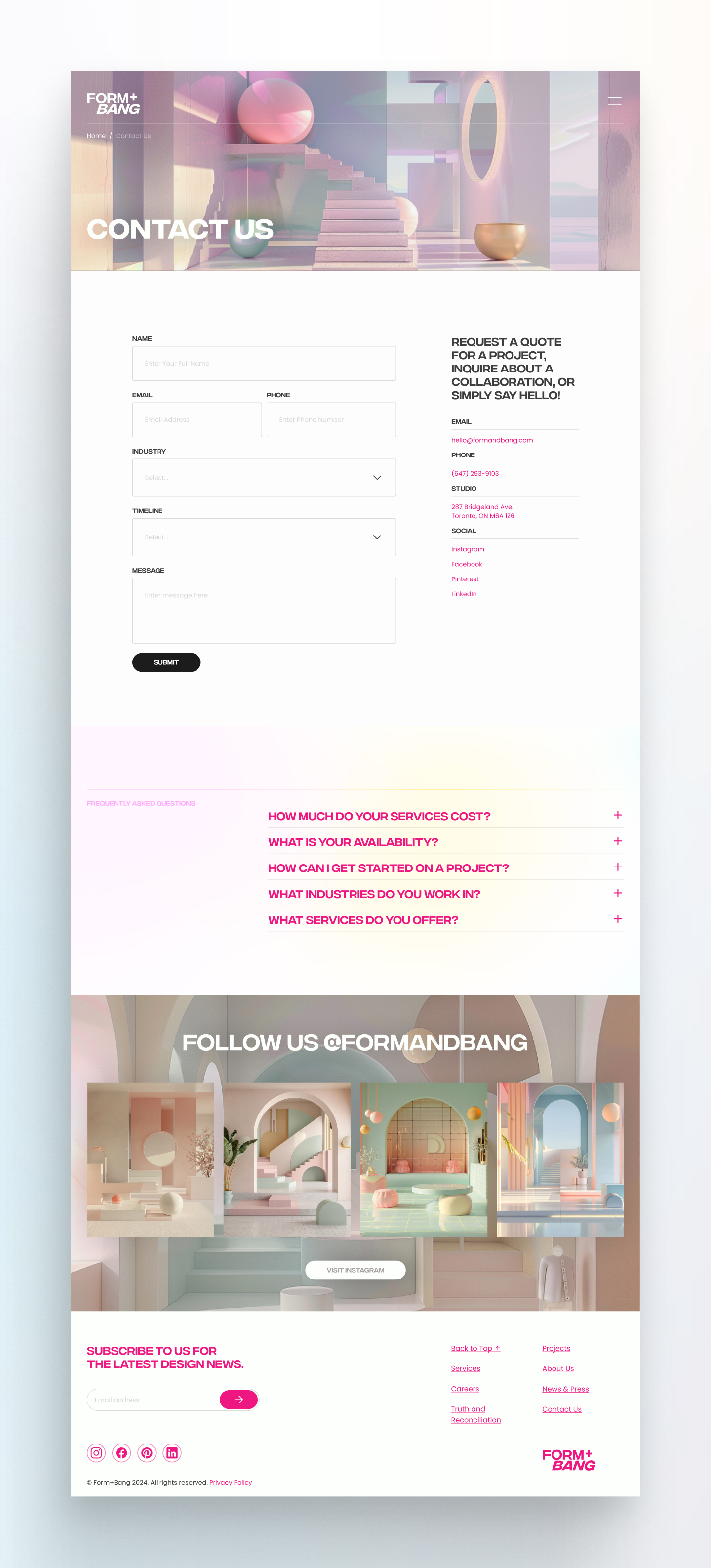
The design direction was minimal and elegant, in line with Form + Bang’s brand identity and the interior design world more broadly. I developed a simple design system that emphasized whitespace, clean typography, and subtle animations to elevate the presentation of their projects. Wireframes established a modular structure, with each section designed to fill the screen, a client request that pushed the layouts toward a more immersive, slideshow like style.
As the project moved into development, challenges emerged. While the original vision prioritized simplicity and balance, the clients requested heavier use of animations and full-page section layouts. These late-stage changes deviated from the minimal design direction, and introduced complexity in terms of development back and forth. My role became one of finding balance, integrating their requests while advocating for best practices in UX and performance. The final build included transitions, a full screen CMS driven slideshow, and custom animations across multiple sections and pages.

The most impactful feature was the custom CMS setup tailored for case studies. This allowed the agency to upload projects into a centralized system that automatically populated both the listings grid and the presentation slideshow. A filtering system made it easy to organize and browse projects by category, while a dedicated presentation mode button transformed the site into a full-screen slideshow, giving the founders a polished, client-facing tool.
To meet client requests, I integrated subtle and dynamic animations throughout the site, ensuring the user experience felt engaging while still aligned with the brand’s refined tone. Every section of the site was designed to fill the viewport, creating an immersive browsing and presenting experience.

Testing focused primarily on how the founders would use the site in practice. In presentation scenarios, the slideshow CMS proved highly valuable, giving the team an intuitive way to showcase their portfolio without needing external software. Clients responded positively to the ability to filter and navigate projects quickly, and the new layout positioned Form + Bang as more professional and polished compared to their previous Squarespace site.
From a usability standpoint, the CMS achieved its core goal: the founders were able to upload and organize new case studies independently without needing external support. However, as the project progressed, the clients requested increasingly complex CMS-driven animations and hover effects layered onto the minimal design. While technically possible, these additions introduced more complexity than originally planned, requiring the clients to think carefully about how they structured content to ensure the animations looked cohesive and flowed well. Instead of being able to drop in content freely, they now had to consider how text, imagery, and interactions would behave with the added motion. Over time, this meant more responsibility for them in maintaining the aesthetic integrity of the site. The constant push for more complexity ultimately compromised some of the original minimal design vision, and while it was at times frustrating, it also became a valuable learning experience in finding middle ground, with balancing client expectations with design practices, and recognizing that part of product design is guiding, but also adapting to, the vision of the people you’re building for.

This project highlighted the importance of balancing design expertise with client demands. While my original minimal design vision would have better served long-term usability and maintenance, and beauty, the clients prioritized a more animated, immersive approach. The result was a site that, while more complex than I initially recommended, satisfied the client’s goals and delivered a presentation-ready tool that elevated their brand in front of prospective clients.
From a UI/UX perspective, the most successful outcome was the custom CMS and presentation mode, which empowered the agency to independently manage their portfolio and use the site as a core part of their client acquisition process. At the same time, the project underscored a valuable lesson: in real-world product design, there is always a balance between user-centered principles, technical best practices, and client vision. Finding the right compromise, while still delivering a polished, functional solution, is as much a part of the design process as wireframing or prototyping.
Check out the website click below.


