Creo

Creo was the first project I fully executed after completing my UX course at BrainStation, and it became much more than a school deliverable. What began as a concept exercise evolved into a product I am actively developing into a real app. My vision was to build a single platform where photographers, models, and studio spaces could be discovered, booked, and paid all in one place. Like if Uber Eats, Linkedin, Behance and Instagram, all had a super baby!
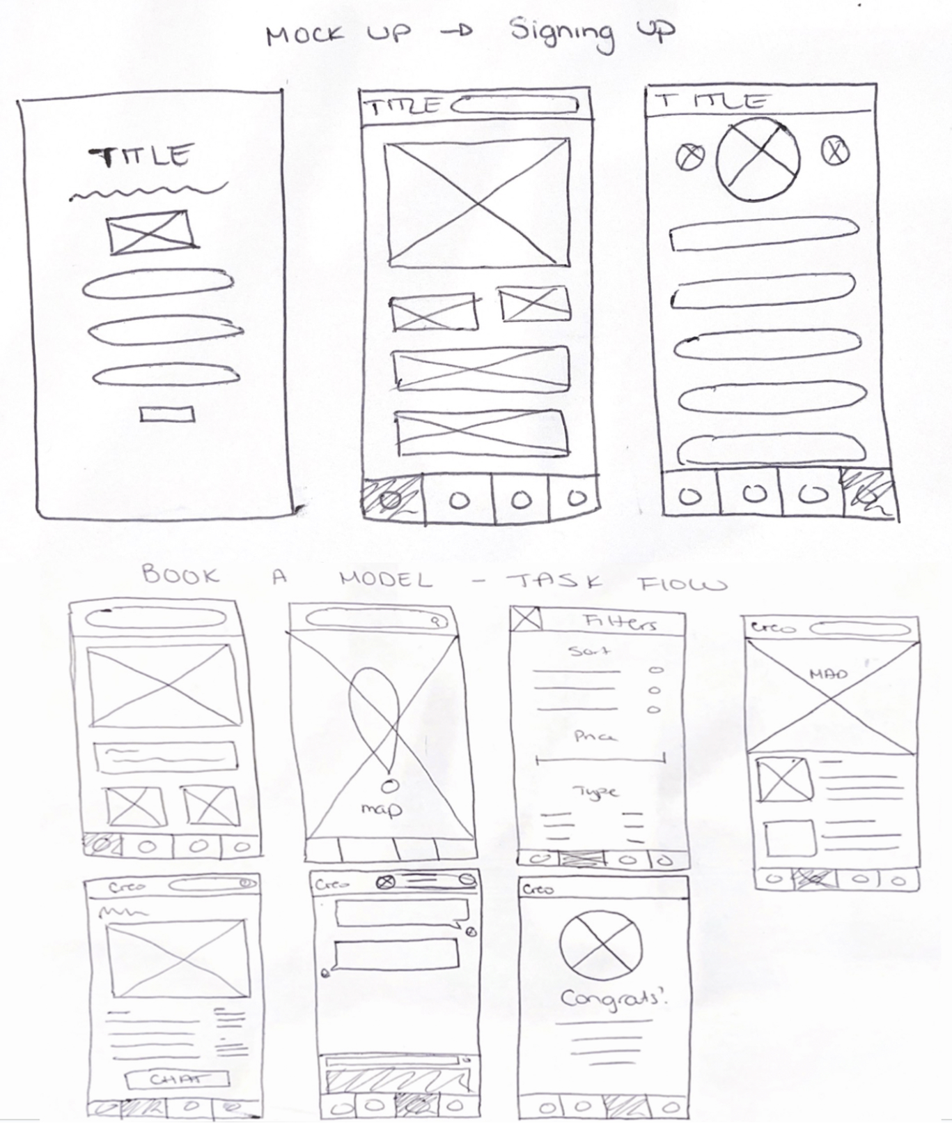
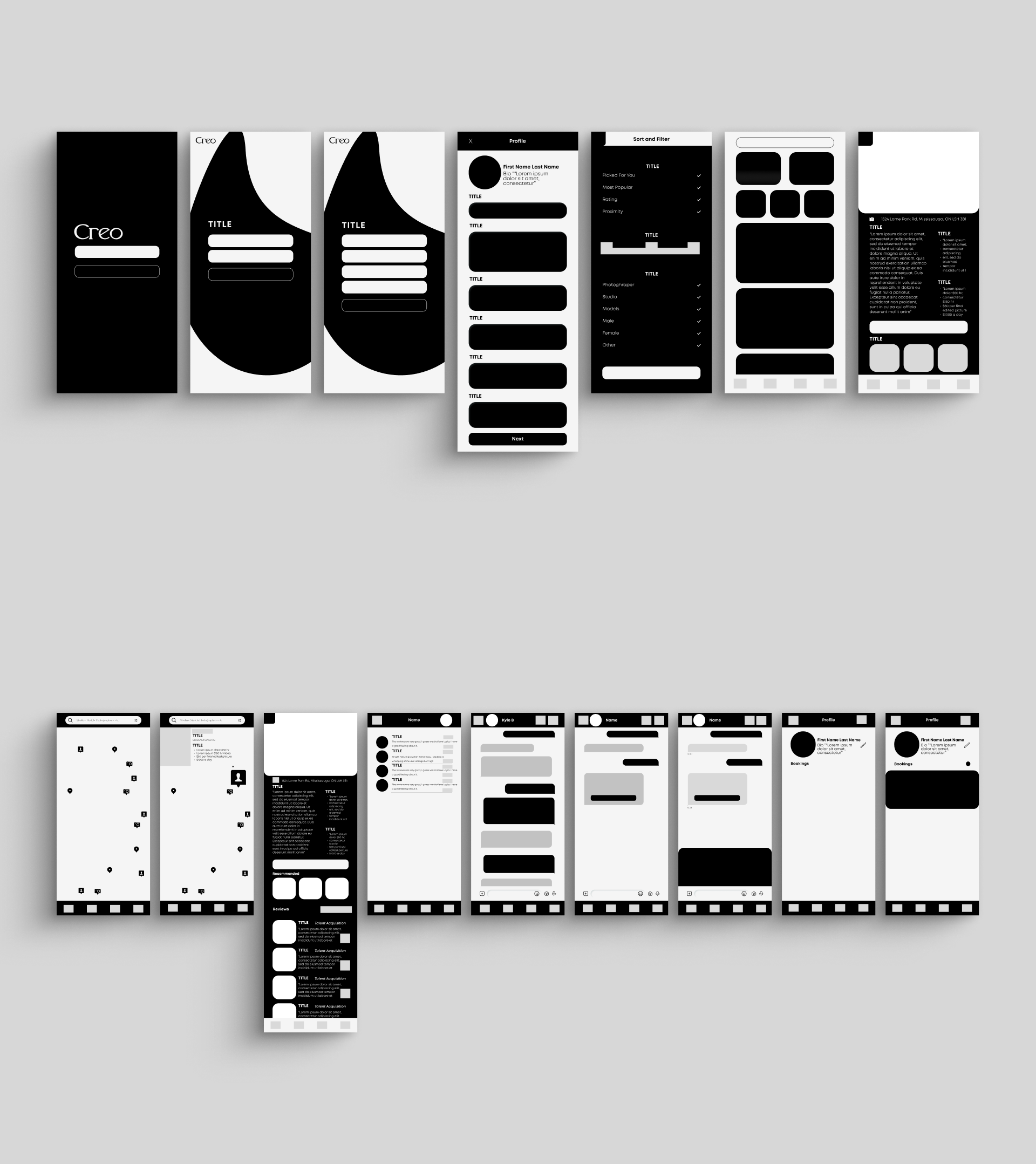
I approached this project from a full UI/UX perspective: user research, information architecture, journey mapping, wireframing, high-fidelity prototyping, and usability testing. Since then, I’ve slowly been iterating with the mindset of a product designer, layering in strategy, technical feasibility, and long term scalability. For me, this case study represents not just my design process, but also the transition from student work into real world product thinking.

In creative production today, assembling a team for a shoot is messy, time consuming, and fragmented. Casting a model often means either going through agencies, losing time and budget, or DM’ing freelancers on Instagram, with delays, unclear pricing, and inconsistent communication. Photographers face similar bottlenecks trying to secure studio spaces or crew. Having worked at a digital marketing agency, I saw these inefficiencies firsthand. Projects often stalled or went over budget simply because finding the right talent and aligning schedules was harder than it needed to be. That experience made it clear to me how broken the process was and inspired the idea for Creo as a streamlined solution.
The pain points became clear:
- Coordination cost: Endless back and forth across channels.
- Information asymmetry: Hidden pricing, unclear availability, opaque terms.
- Drop-off risk: Opportunities lost due to slow responses.
My hypothesis was simple: if I could reduce time-to-book from days of DMs to minutes inside a streamlined app, the impact for creatives would be enormous.

I began with qualitative interviews across photographers, models, studio owners, agency reps, and independent creatives. Rather than asking hypotheticals, I had them walk me through their most recent shoot, who they contacted, what tools they used, what bottlenecks slowed them down.
The insights were striking:
- Photographers: Instagram DMs are slow; by the time they get replies, opportunities disappear.
- Models: Agencies take a large cut of pay; freelancers lack consistent deal flow.
- Studios: Marketing is expensive; bookings often come too late.
- Agencies: Too much time spent coordinating talent across scattered channels.
Across all groups, the theme was the same: the process is fractured and unreliable. This validated my concept for Creo as an end-to-end marketplace that consolidates discovery, availability, booking, and payment.
I also learned how difficult good research really is, from avoiding leading questions, to synthesizing conflicting feedback. It taught me the value of iterative, structured interviews to get past surface-level answers.

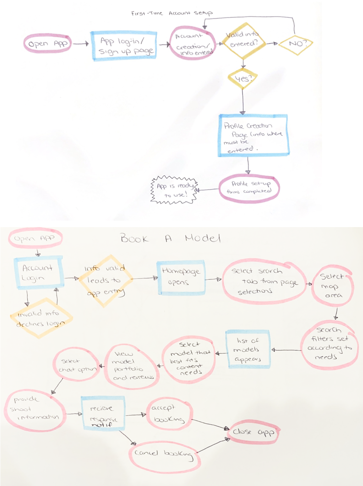
From the start, I treated Creo like a two-sided marketplace with UX as the driver of adoption. My design objective was to minimize friction at every step of the flow: browse → profile → availability → request → confirm → pay.
The value proposition became clear:
- For creatives: Reliable bookings, transparent terms, and less dependency on agencies.
- For clients: The ability to discover talent nearby, instantly see availability, filter by budget or style, and send structured booking requests.
I set a North Star metric for the product, successful bookings per active user, and tied design decisions directly to reducing drop offs between discovery and confirmation. Every screen, component, and flow was built with this principle in mind.

I mapped the IA to reflect real-world decision-making:
- Search: Anchored in location, availability, and category (Photographer, Model, Studio).
- Profiles: Made as decision pages, showing portfolios, rate cards, availability calendars, and reviews.
- Booking flow: Designed as a guided, linear process: select a slot, choose package, submit a brief, confirm, and pay deposit.
A key design choice was to make availability a first-class element, not buried inside calendars. Users could scan weekly schedules, tap open slots, and lock them instantly. On the creator side, onboarding walked them step by step: profile basics → portfolio upload → rate card → calendar sync → payouts.
I designed detailed user flows and edge case handling: expired requests, overlapping holds, cancellation policies, and modification proposals. This ensured Creo worked predictably under pressure, not just in ideal scenarios.

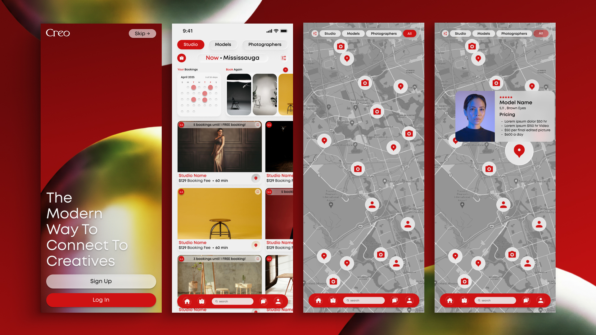
In designing the interface, I emphasized clarity, speed, and trust. Skeleton loaders created a sense of responsiveness. Micro-interactions made availability selections and booking confirmations feel immediate and tangible.
I created a design system with tokens for typography, spacing, elevation, and color roles, ensuring scalability as the app grows. Accessibility standards (contrast, focus states, tap targets) were emphasized from the start.
The visual identity leaned modern editorial, minimal enough to showcase portfolios without distraction, but polished enough to convey professionalism. Navigation was carefully thought out, so users always knew where they were in the app. The focus was on ensuring clarity at every step of the experience, so users felt confident moving through profiles, availability, and booking flows without hesitation.

With a working prototype, I ran structured usability tests that simulated real booking scenarios. The feedback I received highlighted areas where the experience could be made clearer and more intuitive. Based on this input, I refined the flows, adjusted the interface, and improved overall usability. These iterations reinforced a key lesson for me as a designer: usability is never finished. Even small adjustments can have a big impact on whether a product feels seamless or frustrating to use.

Creo is more than my first UX project, it’s a product I am still actively working on today. As my first end-to-end case study after BrainStation, it forced me to confront the realities of user research, iterative testing, and design systems, while also teaching me how to think strategically about product-market fit and scalability.
I also learned a humbling lesson: designing a product is not just about polished screens, but about building systems that can handle real-world complexity, edge cases, and trade offs. Research taught me empathy, usability testing taught me patience, and iteration taught me resilience.
Although life and my full-time work keep me busy, I continue to dedicate time to developing Creo whenever I can. It’s not always easy to balance everything, but this project is something I truly believe in and still plan to bring to life as a real app in the near future. I’m nowhere near finished, but I’ve chosen to share my progress openly on my portfolio. For me, it’s about showing the journey, not just the destination, and building trust by proving that I take projects seriously and push them forward, even when they’re still evolving.

My roadmap is centered around continuing to flesh out the full design and prototype of Creo. I want to expand beyond the current booking flows into a richer, more encompassing creative platform. This includes building multiple feeds, one for rating and reviewing other people’s work, and another for showcasing photography and design projects in a social-style format. I’m exploring concepts like an Instagram inspired grid for portfolios, as well as a swipe based feed, similar to a dating app, where users can quickly like or pass on content to train the algorithm for better recommendations. I also plan to design more account and profile flows, grid based discovery screens, and additional ways to surface opportunities. The long-term vision for the prototype is to combine the best of platforms like LinkedIn, Behance, and Instagram into one cohesive experience, a single space where creatives can showcase work, discover talent, and get booked for jobs or gigs, all while keeping the interface intuitive and inspiring.
This project continues to challenge me and has cemented my confidence as a UI/UX designer. It was the bridge between my education and my career, and it remains a personal project that I’m committed to seeing through from concept to product reality.


